
Exploring the Creative Process with a Fall Color Palette
Back in September, when I started to settle back into my normal routine a little, I found myself starting to collect inspiration images that felt distinctly fall-like — though with a Studio Bicyclette angle, of course. It didn’t take long before I found myself with a desktop folder full of saved images and a board dedicated to this new direction, and I started to notice some patterns in what I had found myself attracted to — rich textures, warm hues with a prevalence of brassy golds, deep yellows and dusty pinks, a hint of darkness, and some shadow play that resulted in a moodiness that felt appropriate with the seasonal shift.
With no real outcome in mind for this collection of inspiration images (usually I put together moodboards with a specific project or client in mind), I realized that I had the opportunity here to turn this into something “just for fun” — which brings us here.
Basically, I’ve decided to turn this concept into a new series of styling posts, meant as a challenge for myself and the Studio B team more than anything, and a way to play with creating more content, practicing our process and a little creative exploration while we’re at it.
I see this new series as having three parts for every iteration:
No. 1 // Inspiration Exploration. Using the process and tools from the Visual Strategy Masterclass — to come up with themes and an overarching creative concept. This is the chance to explore what we’re inspired by and see where it leads. And that’s what I’ll be sharing with you today.
No. 2 // Creative Concept Development. Drawing inspiration from what we explored in the first post, we’ll come up with an idea for a creative shoot of some sort. I think it’ll largely be dictated by the type of content we’re inspired by, and can see this leading in a number of different directions — so I’m not going to place any restrictions on it, as I think that defeats the purpose of letting the creative process lead you.
No. 3 // Focusing on the Details. Since I place such a strong focus on finding those little details and believe that’s where the magic happens, I want to take what we came up with for the creative shoot and take it one step further, narrowing in on a detail that would take it to the next level and diving deeper into that.
And there you have it — three posts over the course of two weeks, a creative process which I’m hoping to play with once a month.
Which of course brings us to today’s post — the first in the process, as I share the original inspiration for this first series and show a little behind the scenes of my exploration for this first concept.
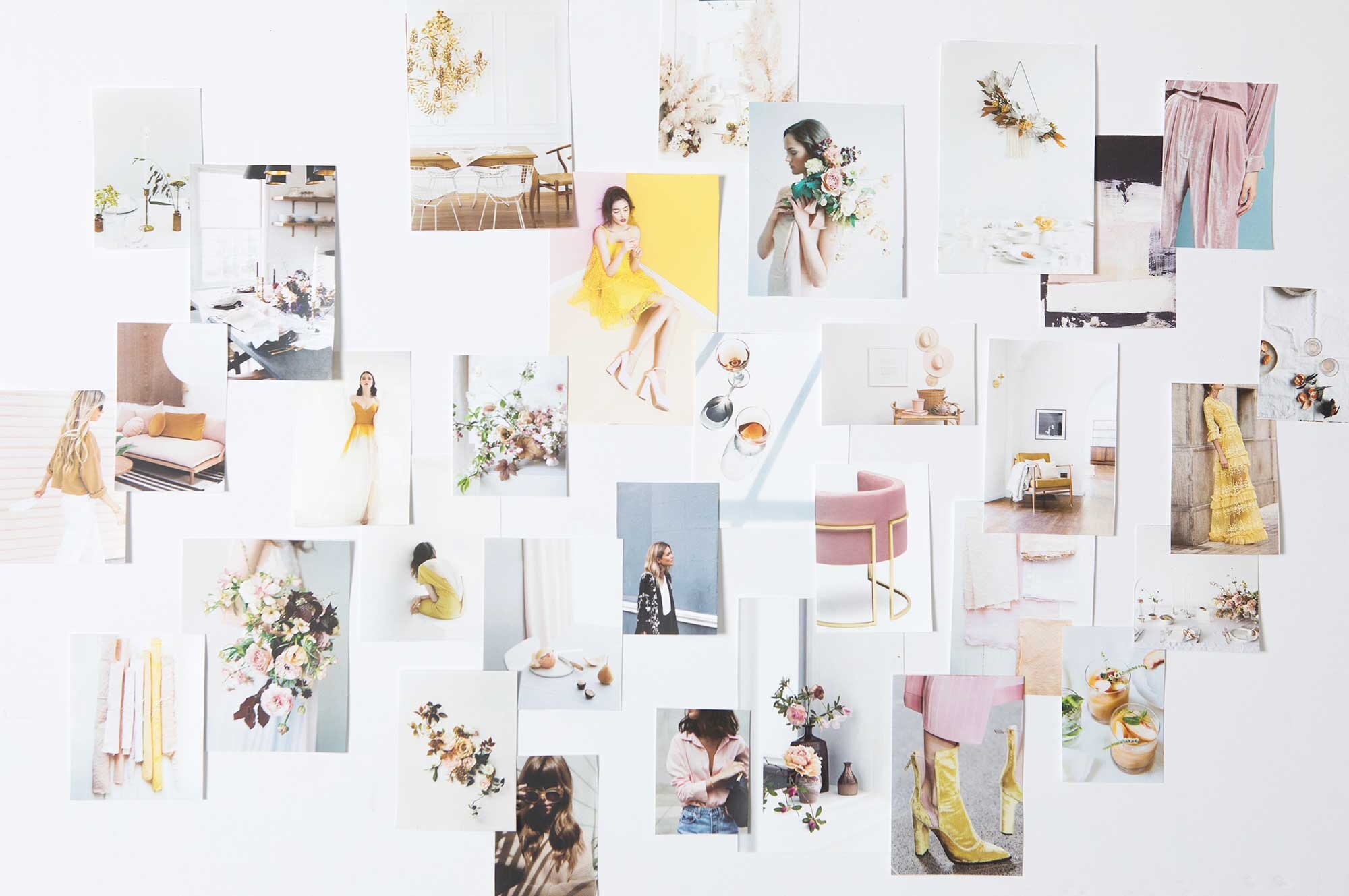
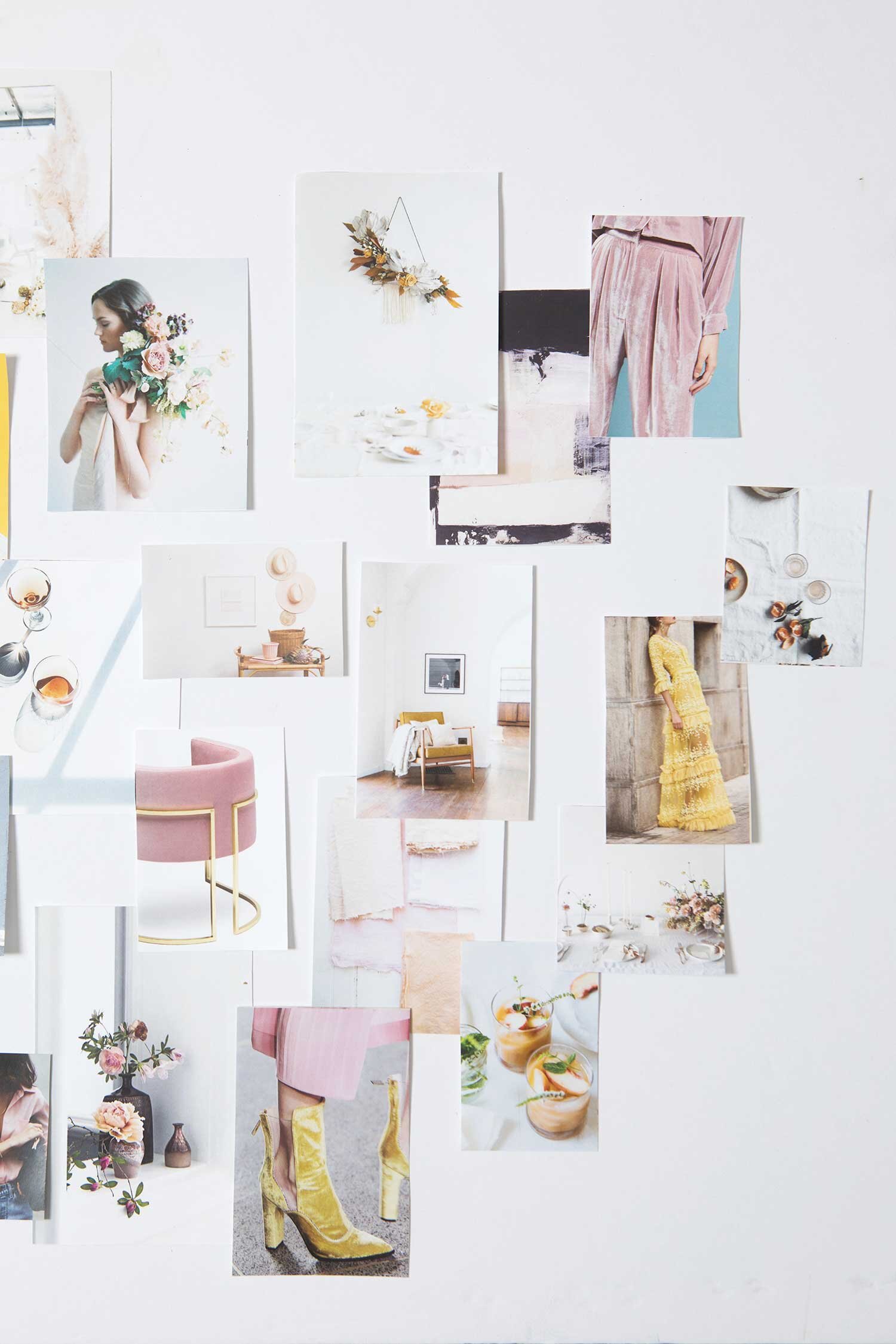


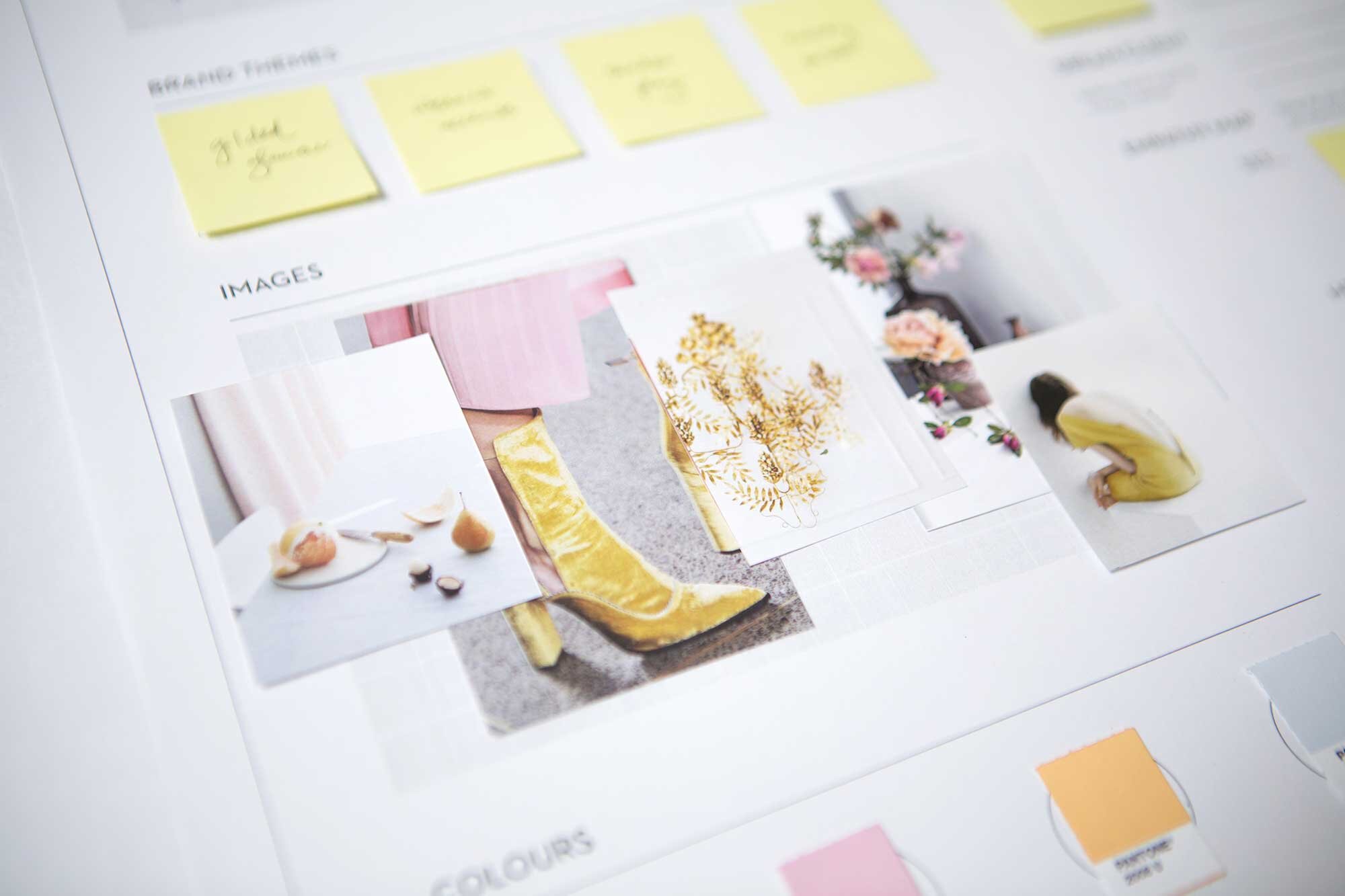
Once I had gathered my inspiration and built a moodboard for this project, I pulled out the two workmats from the Visual Strategy Masterclass. I led myself through the process I use to narrow down inspiration, starting to pull out themes and then finally building a visual strategy — which is what you'll see below. This includes a smaller, curated collection of inspiration images, colour palette exploration, and then starting to actually narrow in on the details that will help us bring this to life in the next phase — when we actually start to style and bring this creative to life.

Once I had gone through this process, I had a pretty clear idea in my head of what I wanted to create and the direction I wanted to take it in — which you may have already guessed from the peeks on Instagram or the items that start to show up here. This is when I started pulling props and styling details from around the studio and played around with a few little DIY projects, helping me to determine what else I needed to source to bring the vision together. And for that, I'm afraid you'll have to wait until the next post!


One of the things that I found interesting about this process was how it helped me to explore my own style and push my creative tendencies outside of my comfort zone — in this case, largely through a colour palette that included colours I don't normally find in my brand suite.
I talk a lot about consistency in branding, and more specifically, in colour as well, but what happens when you feel a shift in what you’re drawn to? Perhaps it’s a seasonal change, or maybe a new source of inspiration, or you simply find yourself pulled towards a different colour palette as your brand evolves.
As I was going through this collection of inspiration images, I realized that the visuals I was drawn to weren't relegated to this project only — they truly represent a seasonal mood for me, and will likely show up in a number of ways beyond this one creative project.
Here are a few of the ways I see them taking shape for me:
Unstructured army jackets layered with more feminine pieces.
Soft blush and dusty rose tones — the more textural the better, and bonus points for luxurious velvets that catch the light just so. Is it just me, or is anyone else experiencing a serious velvet love affair right now?
Delicate touches of gold in the form of tiny layered necklace and shimmery earrings, or metallic details throughout the home.
Rich yellow accents brought in through floral print accents and mimicked in brassy gold tones.
Lush greenery — the more jungle-like, the better.