
Styling a Tablescape with Pink and Gold Details
It started with a folder of inspiration images on my desktop and a gravitation towards a fall-toned colour palette filled with dusty pink and golden details, and after taking it through my creative process and dissecting it a little bit, it started to take form as a tablescape design.
You could file “host dinner (or brunch) parties” alongside a few other adult activities that I wish were actually part of my reality, so maybe this can be considered a trial run of sorts?
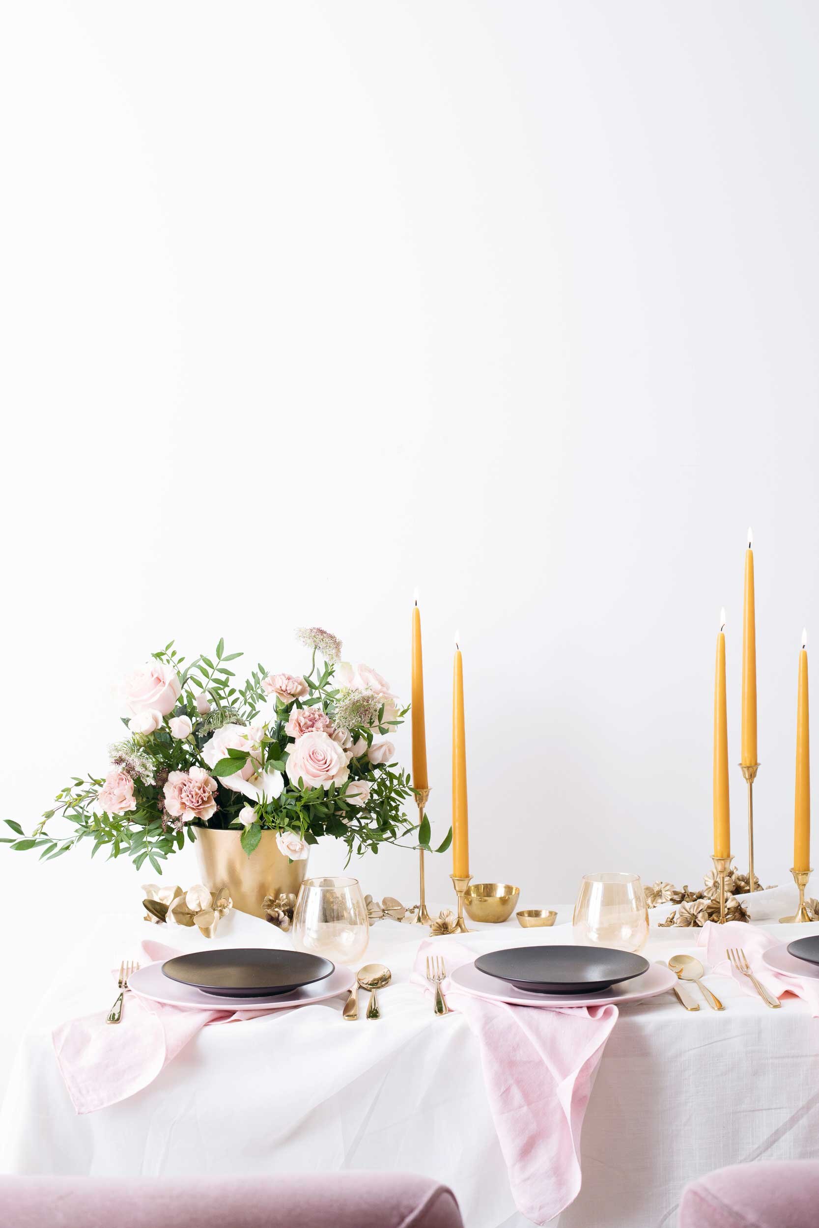
The colour palette I wanted to play with was my starting point, and those pinks and golds dictated what props I chose, adding in the black side plates as a way to add that moody touch without overwhelming it too much or taking away from the bright and airy feeling that I still wanted to emulate as part of the signature Studio Bicyclette style. Dusty pinks provided a basis to play off of with the dinner plates and the napkins, and then I picked up a few yards of two inexpensive ivory fabrics to cover the table with, providing a nice texture, a little more dimension and a soft movement across the table (which is actually my desk — sometimes you have to get creative!)


The gold was infused through the candle holders and cutlery, and then I was also really inspired by the idea of gold florals, so I picked up fake blooms and greenery from the dollar store and a can of gold spray paint to see what I could come up with. A couple of quick coats later, I had gilded a handful of stems, pulling off individual blooms and making sure I had a nice variety of shapes and sizes to play with.

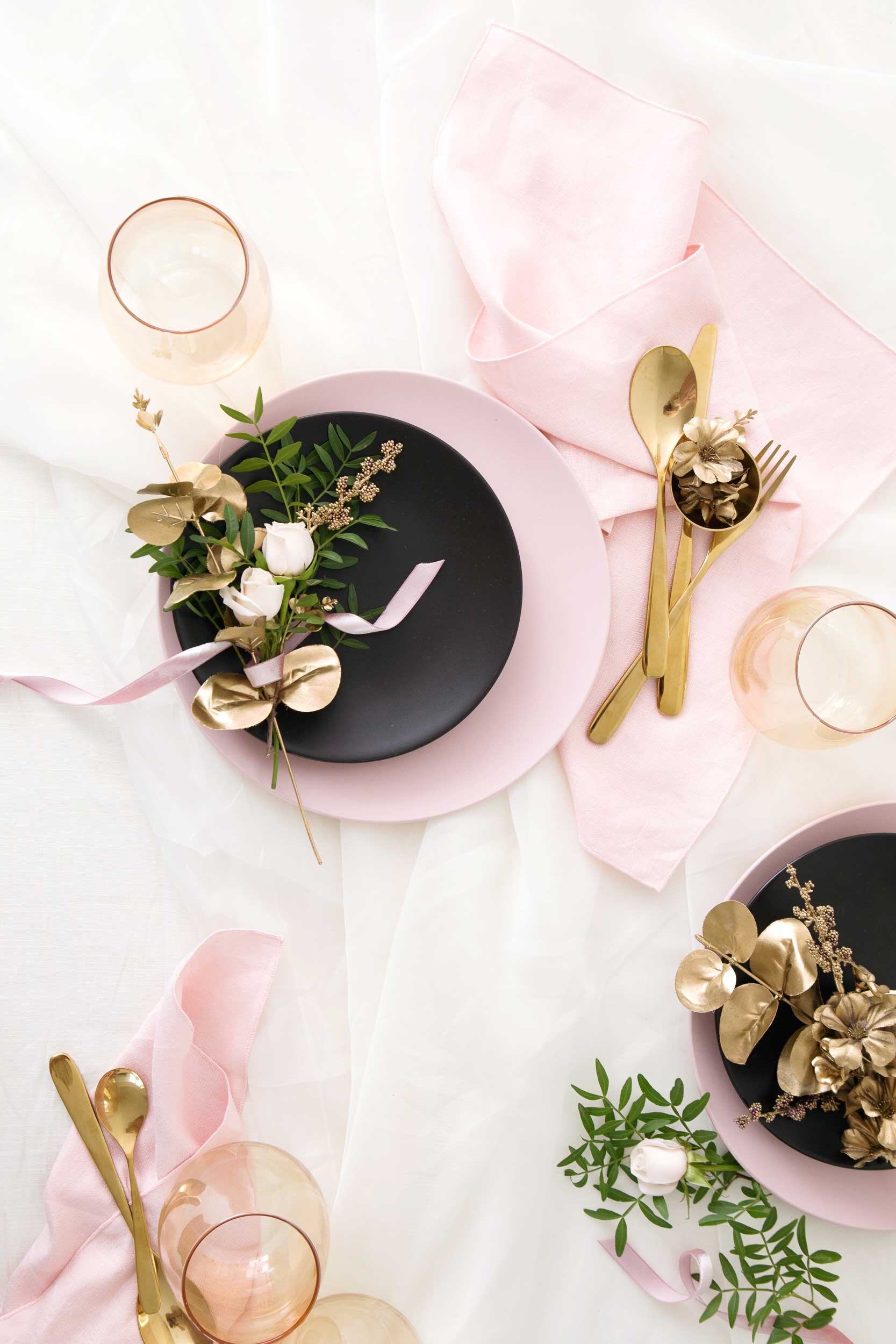
I wanted to tie in a few pops of the yellow that had shown up in my inspiration as well, which I did through the candles and then also through the glasses I found, which had a beautiful iridescent effect that wasn't too overwhelming but still tied in nicely to both the yellow and gold. A little side note when styling, is the importance of paying attention to how various elements interact with each other, how they balance each other, provide contrast, or lead from one detail to the next. You're looking to create a cohesive visual experience while also adding in points of interest to lead the eye through.


The idea with this project was to really focus on taking that original inspiration and develop it into a fully formed creative concept — while giving myself some space to play, so I really focused on capturing the details as well, since a styling a creative like this is really all about layering and pulling everything together to tell a visual story. And, coincidentally, some of my favourite shots from this ended up being those detail shots of the props and the "mess" on the table after we had started to take it apart.
Once we had styled and captured the tablescape, we also took it one step further thanks to our friends at Kitten and the Bear, adding in some of their scones and a spread of their new fall collection of jams. I thought that would be the perfect addition to this tablescape — adding a little more fall into the mix and complementing what we had designed. So if you'd like to see how we did that — and preview a few of the absolutely delicious flavours they've recently released — you can pop on over to their blog for that.
We also worked alongside them for the final instalment in this series, which will be focusing on a final detail to help bring this vision to life, so keep your eyes out for that soon — because trust me, it's one you won't want to miss!
Yummi Candles // HomeSense Glasses // Ikea Pink Plates and Gold Flatware