Why You Need a Visual Directive for Your Photoshoot
If you haven’t noticed by now, I’m pretty captivated by the creative process. There’s something about digging into how people work, diving deep into their creative psyche and breaking it all down that just gets me going. It’s like getting the ultimate peek behind the scenes, and you know how much I love that.
I just started reading Twyla Tharp’s The Creative Habit (devouring might be a better word — seriously, so good), and one of the biggest threads throughout the book is that of, well — the necessity of forming a habit around creativity. If you think of our creative processes (and I know that each and every one of ours, not to mention for different projects, types of work, etc. is going to be so different from the next), one of the reasons why it’s so beneficial to have a process in the first place is because it makes it easier for us to do our jobs, to be creative. It provides a little bit of structure to an otherwise not-so-structured task, and helps us to flex our creative muscles because of this. And who doesn’t like that?
I know for me, my creative processes are constantly evolving. I’m learning what works best for me, I’m learning new skills and knowledge that I may want to weave in, I’m receiving feedback from others, all of which pushes me to regularly step back and reevaluate.
This is how I came to add a new piece into my creative process recently — The Visual Directive.

The Role of a Visual Directive
It essentially came out of a need to communicate visually with a client or collaborator about a specific direction we were aiming for when creating branded content. Moodboards have always been a key piece in my creative process and though they are so great and remain one of my favourite elements to execute, it was starting to feel like we needed an extra tier that captured a little more information and took it one step further.
The problem wasn’t that I wasn’t taking this extra step, but that I hadn’t figured out a good way to share it with whoever it was I was working with. I tend to do a lot of creative synthesis in my own head, and of course if there’s someone else involved in a project, they can’t be expected to get inside my head and see what I’m seeing or make the appropriate links.
If you’ve taken my Visual Strategy Masterclass, you’ll know that I have broken down this part of the process as part of that — which is where the two workmats I’ve developed, the Brand Theme Breakdown and the Visual Strategy Canvas, come in. These essentially represent how I work behind the scenes and were intended to provide a tool that allows others to do the same — taking those dreamy inspiration boards and turning them into a visual strategy.
The gap I was facing occurred when I was working with someone on an external project where I was still going through the process but then needed to essentially show them the result.
So that is where the Visual Directive comes in. Still following?
What's Included in a Visual Directive
I still start with a moodboard, and it’s usually a big, robust, messy one — in the best possible way. Everyone involved in the project contributes to it (this usually happens on Pinterest), we don’t worry about images being “perfect” for the project or making the final cut, and we try to just capture the overall visual direction we want to go in. This then gets narrowed down and appears at the beginning of the visual directive — mostly as a way to visually capture the vibe and overall feel of the shoot.
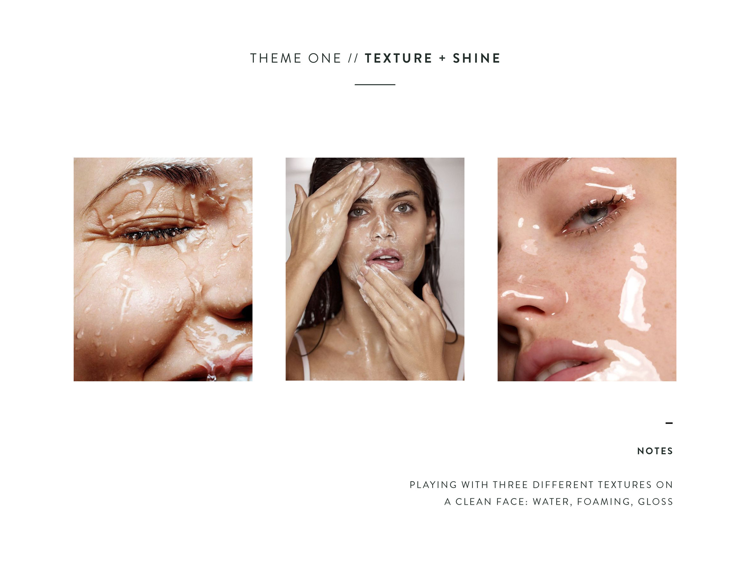
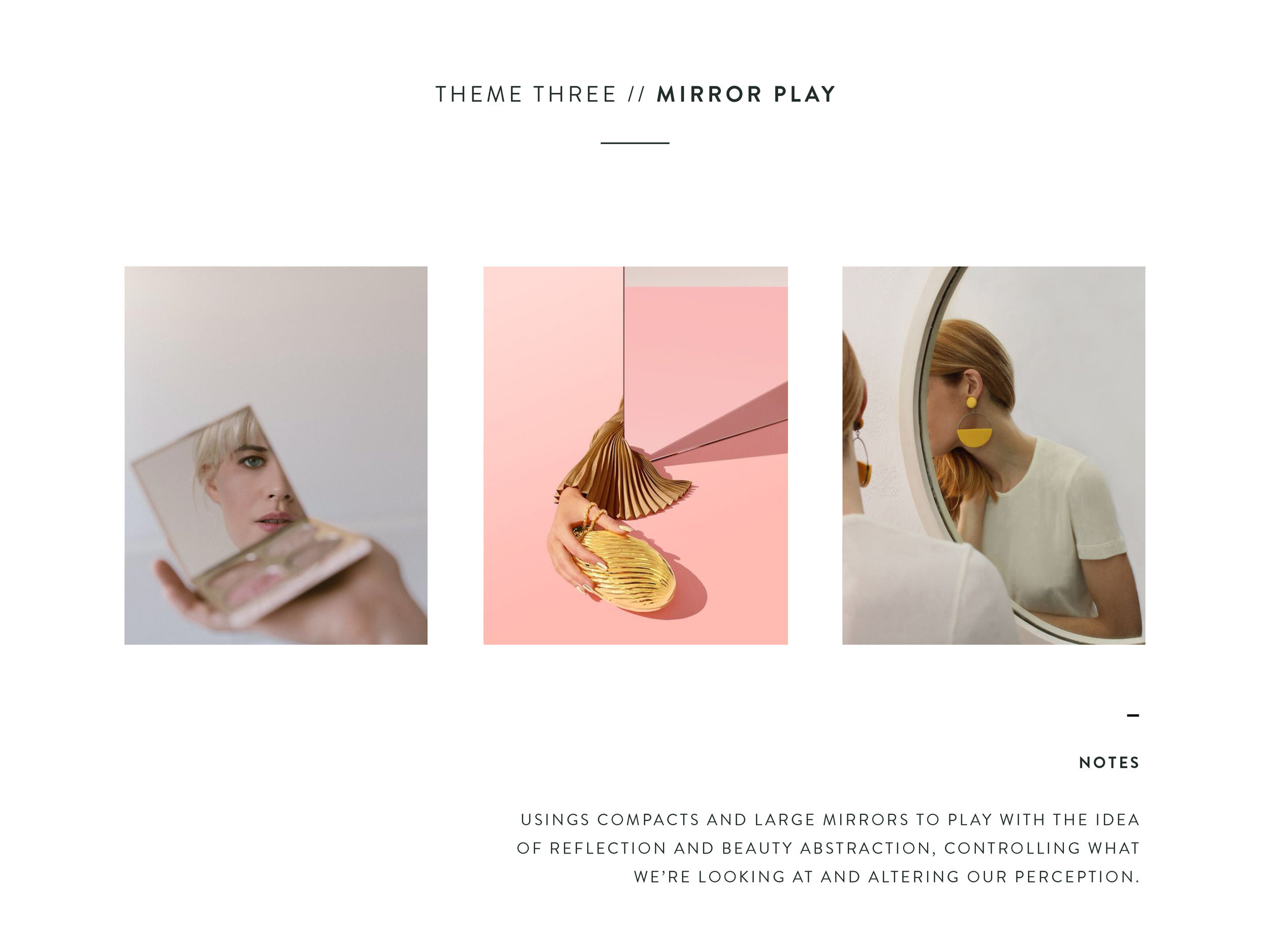
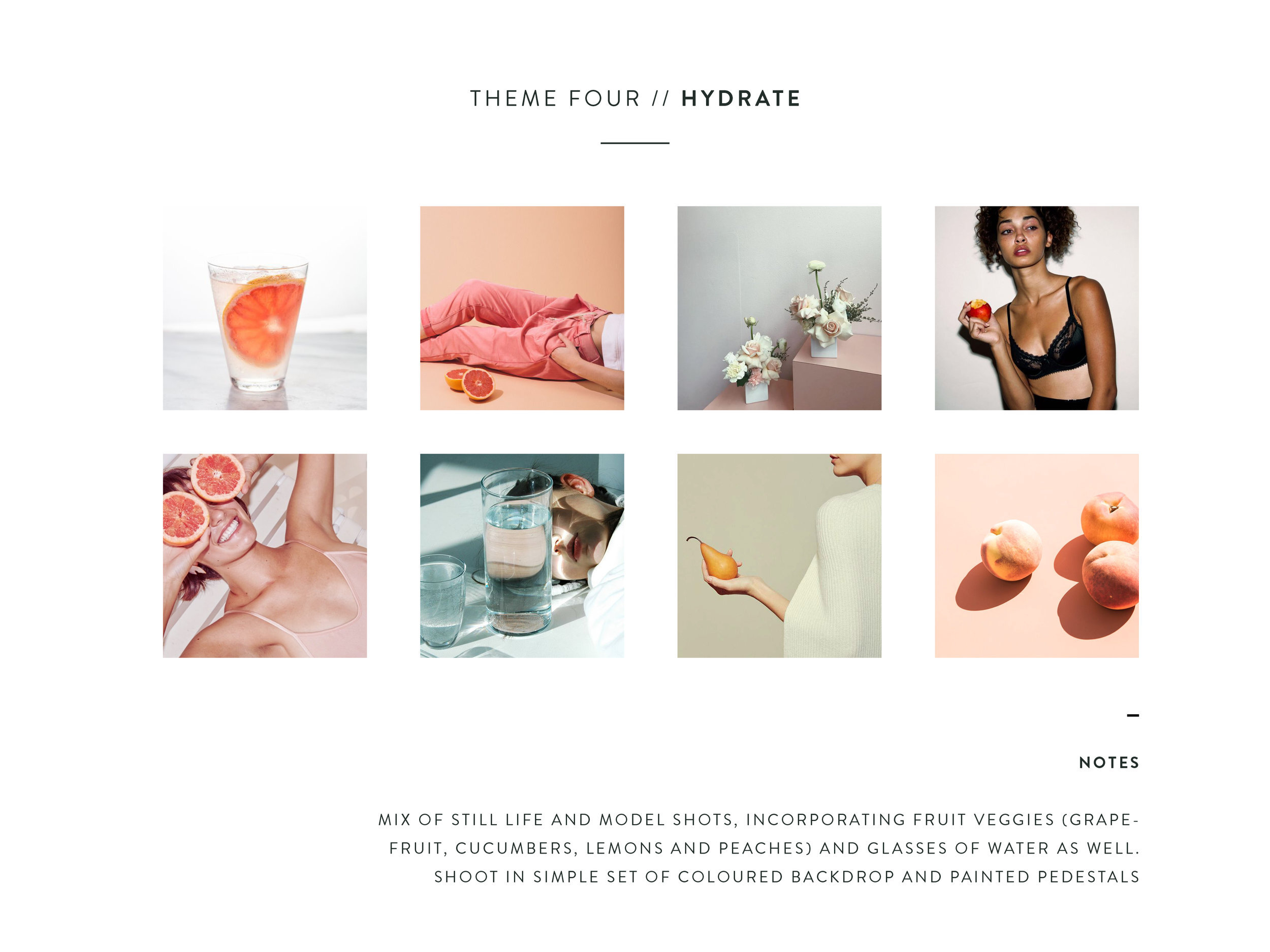
Then (and this step would be equivalent to module three in the VSM), I start to look for patterns within the content and build out themes. These can be related to colours, textures, styles, content, props, backdrops… the options are endless and specific to the project, but this is where the magic happens, and where I believe I add a lot of value. We’re taking these visual cues and creating something new with them, wrapping them up in our own style and the specific intentions of the creative project so that it takes on a new life. Adding our thoughts and ideas to the imagery along the way in order to be able to communicate the direction all this is going in.
And that forms the basis for a visual directive. I don’t have a specific template that I’m using yet (but stay tuned, this is going to play a key role in the next Brand it Beautiful course!), but it’s essentially built out by identifying these different themes, including a few select images for each as reference, and then adding my own notes and commentary from there. It basically serves as another way to communicate with anyone else who’s involved in order to find ourselves on the same page and align on where we’re headed. It also serves as the basis for developing a detailed shot list — but I’ll save that for another post.
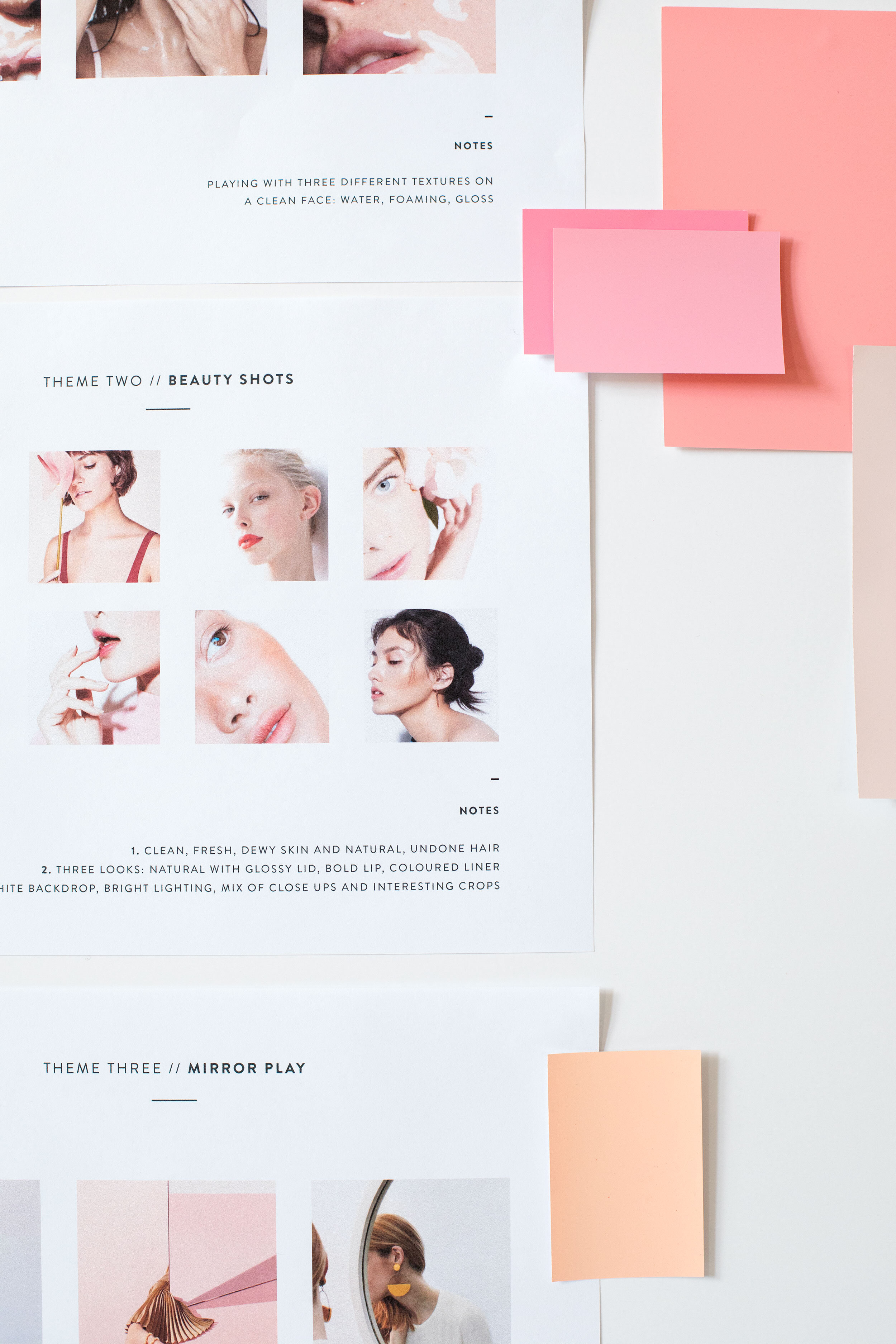
I might also include a colour palette that emerges as a result of this process, or specific wardrobe options that we’ve identified — it depends, but you’ll see these included in the example here. It gets printed out, hung on the walls, layered with colour swatches and built upon until it feels right. It travels with you to pick out paint colours and props, and on the shoot day itself, it's hanging up for all to see as a point of reference and visual reminder.
If I was working on a visual directive for a shoot that involved product, or was for a specific brand, I’d likely also include a brief overview about the product and brand for easy reference, and for any team member who might not be as familiar. Same goes for the brand identification — if there are specific elements or imagery that is already part of the brand and should be included for reference. You’d also see tone words for the brand captured in the directive, maybe a quote or manifesto that speaks to what the brand stands for, and all of that would sit prior to actually diving into the inspiration, prop list and shot list, so it’s all building up.
What a Visual Directive Looks like for a Creative Shoot
Since we recently shared our new series Beauty School Dropout which involved a creative shoot for which I built out a simple visual directive (again, this is a relatively new addition to my creative process, so I think this was only the third of its kind?), I thought I’d use that to show you exactly what this looks like. It’s a great example since you can actually look at the final result and see where we ended up using the visual directive as a guide.