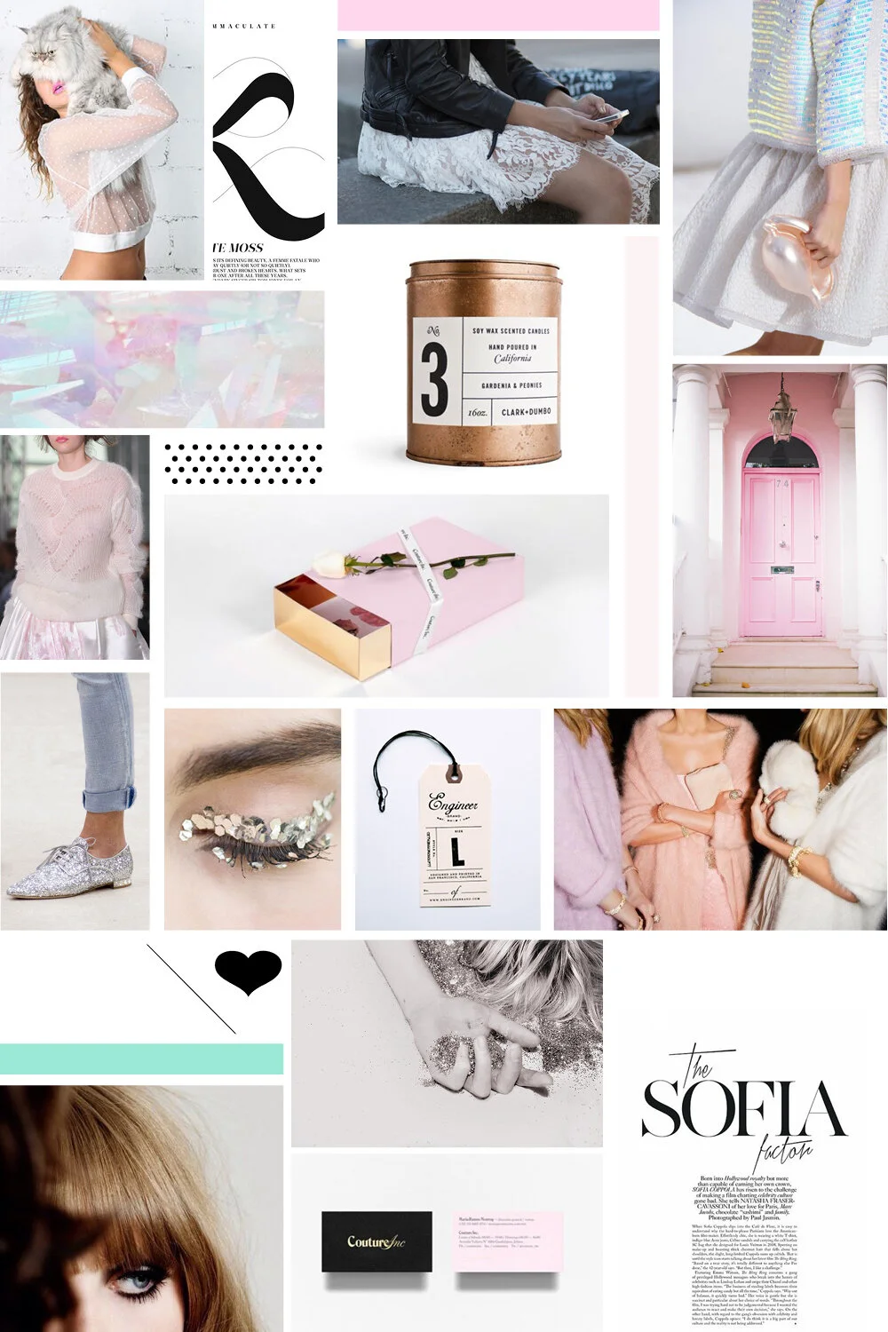
Studio Bicyclette Brand Inspiration Board
I've alluded to it a number of times over the past few months, and you've probably noticed hints here and there that Bicyclette is undergoing a little bit of a transformation, entering into its next phase as Studio Bicyclette. As I embark on this process, and since branding and styling play a key role in this newest iteration of Bicyclette, I want the blog to be a place of transparency, and to share the journey and behind-the-scenes as my business shifts from one model to the next.
Though I've started working on a number of branding projects for other businesses and brands, I'm quickly learning that tackling the challenge for my own rebrand proves to be much more difficult. In the same way that writing your own bio is practically impossible without outside input, or styling someone else is often easier than figuring out what you want to wear on any given day, I think the challenge stems from having to really dive deep and figure out what it is your brand stands for, and commit to a visual identity that represents the core values. For this rebrand, I wanted to take the time to go through the process that I would use for any big creative project, and start with a brand inspiration board.
Inspiration plays a pretty key role in my day-to-day. My studio walls are covered with images and random little pieces of magic I find that strike my fancy, Pinterest is a go-to tool when I'm hunting for visuals to help tell a story, plan a photo shoot or communicate an idea, and my Instagram account is often used to capture any moments of inspiration I may stumble upon. But when it comes to editing all of those images down and really getting to the core of a visual identity, that's where things get tricky. Every image needs to be justified, to represent an element of the brand that is important, communicating the vision, values and look of the brand.
So here is my first version of the Studio Bicyclette brand brandinspiration board. For all the pretty pictures and magical imagery that has come to be closely associated with Bicyclette, there's also a clean and graphic element to the brand that is just as important. Crisp blacks and whites, and an attention to detail and typography that represents the more professional, "business" side of the brand. I've always been drawn to juxtapositions - "city life with a whimsical twist" is still a phrase that I think captures the essence of Bicyclette to near perfection - and I love the play of these elements set against the more whimsical and dreamy photos. I'm a firm believer in the necessity of white space in any design, and have always been drawn to a variety of textures with a dash of metallic and the customary sparkle top it all off.
I'd love to hear your thoughts and feedback. Did I manage to capture the Bicyclette brand with this inspiration board?

