Brockton Gems
Brockton Gems
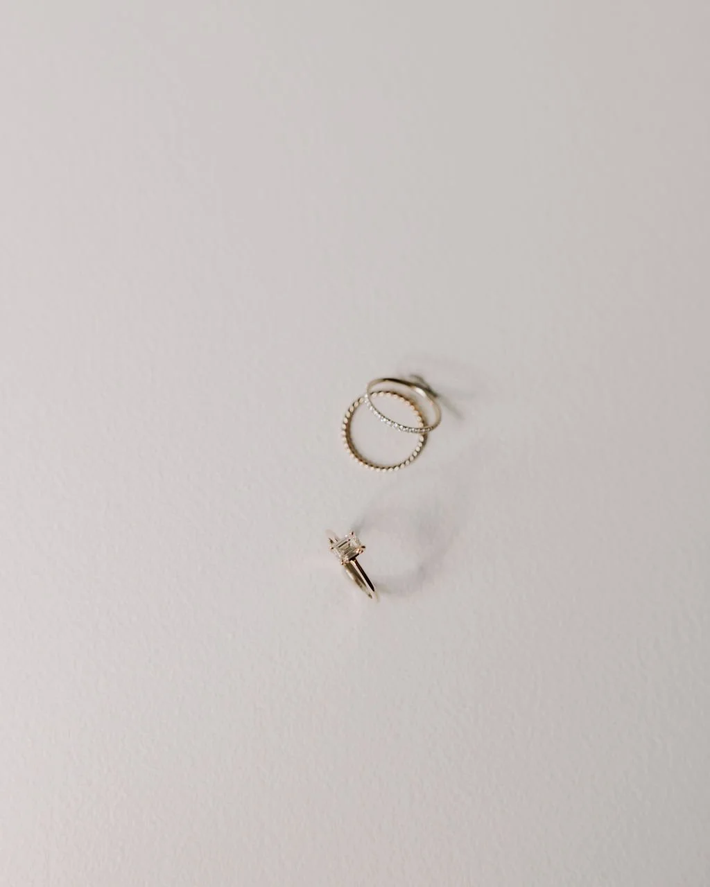
Reimagined vintage and untraditional jewellery for the contemporary couple that values modern simplicity and thoughtful designs.
Services
Brand Strategy, Creative Direction and Design
Packaging and Brand Experience
Social Media Strategy and Content Calendar
Styling and Photography
Shopify Website
Behind the Brand
Our intention for the Brockton Gems brand was to bring to life the aesthetic of the jewellery itself — classic yet modern, sophisticated yet understated. Rooted in intentional minimalism, the core of the brand is shown in black and white, drawing in subtle natural textures and vintage-inspired details, reimagined.
We want the brand to feel elevated but approachable, an identity that can grow with the business and remain timeless. Our aim is to bring the quintessential French girl style to life — sophisticated simplicity, understated and effortless.


“Hiring Paige and her team at Slow Dance Studio was the best investment I ever made in my business. They were able to help me refine, elevate and bring my business vision to life in a way I couldn’t on my own.
I feel that Paige really listened and understood what I wanted and had the skill to execute that vision. I really loved that her team was able to help me with all brand aspects from packaging, content creation, web design to social media seamlessly. The end result of her multi-faceted approach was the elevated three-dimensional brand that I had been dreaming of.”
Taren
Owner and Designer

DEEPER MEANING
The core brand identity featured a classically bold, minimal uppercase type treatment, commanding attention through the weight but in a subtle, simple way thanks to the minimal lines and unfussiness. The brand as a whole is largely type-based, using a number of vintage-inspired fonts to add balance and interest, playing with contrasting weights, proportions and style.
A delicate script maintains the clean lines that are important to the brand but adds in that feminine touch, and minimal sans-serif fonts are used throughout in slightly different interpretations. We’ve added in handdrawn touches but kept them minimal so as not to overdo it and to maintain the authenticity of the details.
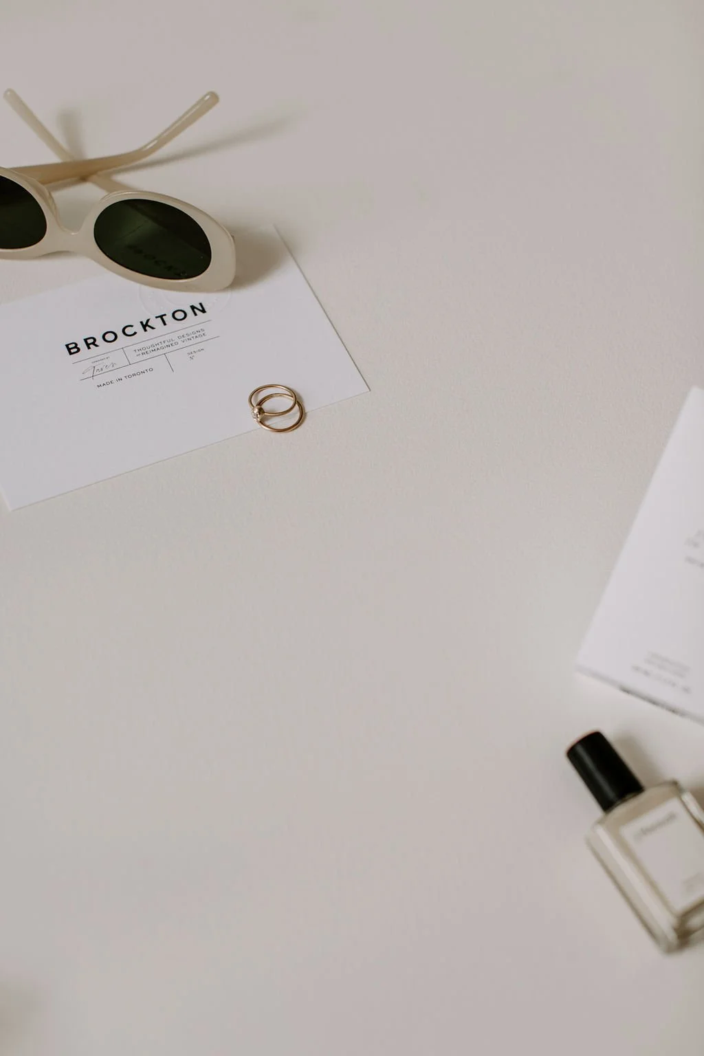
Imagery — and how the brand identity and type treatment is paired with the visuals — is extremely important, helping to tell the story of the brand and create the full experience.
The colour palette incorporates neutral touches and hints of dusty blush and faded olive, colours that feel antique, soft and discreet while still maintaining that classic timelessness.